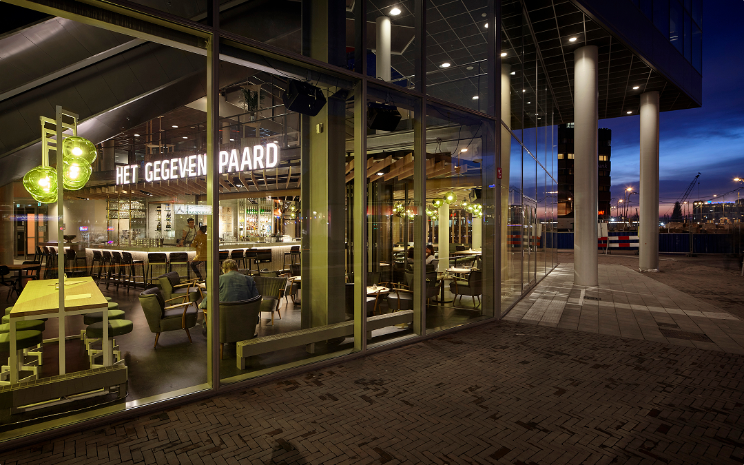
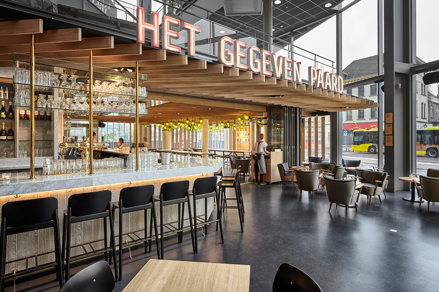
You don't look a gift horse in the mouth, right? Somewhere in the Netherlands there is this bar. It’s called ‘Het Gegeven Paard’. Translation: ‘The Gift Horse’. The name is an unmistakable reference to the expression “You don’t look a gift horse in the mouth” and a play on the core concept of the bar, which serves free food to the punters coming in for a drink.
You don't look a gift horse in the mouth, right? Somewhere in the Netherlands there is this bar. It’s called ‘Het Gegeven Paard’. Translation: ‘The Gift Horse’. The name is an unmistakable reference to the expression “You don’t look a gift horse in the mouth” and a play on the core concept of the bar, which serves free food to the punters coming in for a drink.

Research
You don't look a gift horse in the mouth, right? Somewhere in the Netherlands there is this bar. It’s called ‘Het Gegeven Paard’. Translation: ‘The Gift Horse’. The name is an unmistakable reference to the expression “You don’t look a gift horse in the mouth” and a play on the core concept of the bar, which serves free food to the punters coming in for a drink.
Concept
Design
Build
You don't look a gift horse in the mouth, right? Somewhere in the Netherlands there is this bar. It’s called ‘Het Gegeven Paard’. Translation: ‘The Gift Horse’. The name is an unmistakable reference to the expression “You don’t look a gift horse in the mouth” and a play on the core concept of the bar, which serves free food to the punters coming in for a drink.
You don't look a gift horse in the mouth, right? Somewhere in the Netherlands there is this bar. It’s called ‘Het Gegeven Paard’. Translation: ‘The Gift Horse’. The name is an unmistakable reference to the expression “You don’t look a gift horse in the mouth” and a play on the core concept of the bar, which serves free food to the punters coming in for a drink.
You don't look a gift horse in the mouth, right? Somewhere in the Netherlands there is this bar. It’s called ‘Het Gegeven Paard’. Translation: ‘The Gift Horse’. The name is an unmistakable reference to the expression “You don’t look a gift horse in the mouth” and a play on the core concept of the bar, which serves free food to the punters coming in for a drink.

You don't look a gift horse in the mouth, right? Somewhere in the Netherlands there is this bar. It’s called ‘Het Gegeven Paard’. Translation: ‘The Gift Horse’. The name is an unmistakable reference to the expression “You don’t look a gift horse in the mouth” and a play on the core concept of the bar, which serves free food to the punters coming in for a drink.
You don't look a gift horse in the mouth, right? Somewhere in the Netherlands there is this bar. It’s called ‘Het Gegeven Paard’. Translation: ‘The Gift Horse’. The name is an unmistakable reference to the expression “You don’t look a gift horse in the mouth” and a play on the core concept of the bar, which serves free food to the punters coming in for a drink.
You don't look a gift horse in the mouth, right? Somewhere in the Netherlands there is this bar. It’s called ‘Het Gegeven Paard’. Translation: ‘The Gift Horse’. The name is an unmistakable reference to the expression “You don’t look a gift horse in the mouth” and a play on the core concept of the bar, which serves free food to the punters coming in for a drink.
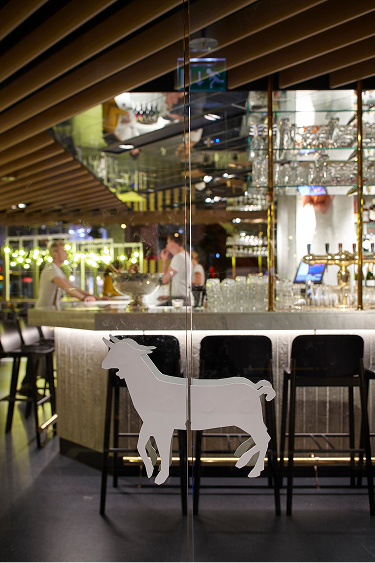
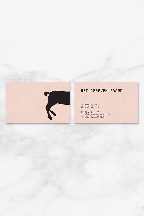
Maybe it caught your eye already: the logo of ‘Het Gegeven Paard’, or ‘The Gift Horse’ in English, is actually a goat. No, this is not a mistake. It was created with the same ‘don’t look a gift horse in the mouth’ motto in mind. Because a gift logo shouldn’t be looked in the mouth either, even if it turns out to be a goat. To be honest, no one ever noticed. Not even our client…
Maybe it caught your eye already: the logo of ‘Het Gegeven Paard’, or ‘The Gift Horse’ in English, is actually a goat. No, this is not a mistake. It was created with the same ‘don’t look a gift horse in the mouth’ motto in mind. Because a gift logo shouldn’t be looked in the mouth either, even if it turns out to be a goat. To be honest, no one ever noticed. Not even our client…
Research
Maybe it caught your eye already: the logo of ‘Het Gegeven Paard’, or ‘The Gift Horse’ in English, is actually a goat. No, this is not a mistake. It was created with the same ‘don’t look a gift horse in the mouth’ motto in mind. Because a gift logo shouldn’t be looked in the mouth either, even if it turns out to be a goat. To be honest, no one ever noticed. Not even our client…
Concept
Design
Build
Maybe it caught your eye already: the logo of ‘Het Gegeven Paard’, or ‘The Gift Horse’ in English, is actually a goat. No, this is not a mistake. It was created with the same ‘don’t look a gift horse in the mouth’ motto in mind. Because a gift logo shouldn’t be looked in the mouth either, even if it turns out to be a goat. To be honest, no one ever noticed. Not even our client…
Maybe it caught your eye already: the logo of ‘Het Gegeven Paard’, or ‘The Gift Horse’ in English, is actually a goat. No, this is not a mistake. It was created with the same ‘don’t look a gift horse in the mouth’ motto in mind. Because a gift logo shouldn’t be looked in the mouth either, even if it turns out to be a goat. To be honest, no one ever noticed. Not even our client…
Maybe it caught your eye already: the logo of ‘Het Gegeven Paard’, or ‘The Gift Horse’ in English, is actually a goat. No, this is not a mistake. It was created with the same ‘don’t look a gift horse in the mouth’ motto in mind. Because a gift logo shouldn’t be looked in the mouth either, even if it turns out to be a goat. To be honest, no one ever noticed. Not even our client…
Maybe it caught your eye already: the logo of ‘Het Gegeven Paard’, or ‘The Gift Horse’ in English, is actually a goat. No, this is not a mistake. It was created with the same ‘don’t look a gift horse in the mouth’ motto in mind. Because a gift logo shouldn’t be looked in the mouth either, even if it turns out to be a goat. To be honest, no one ever noticed. Not even our client…
Maybe it caught your eye already: the logo of ‘Het Gegeven Paard’, or ‘The Gift Horse’ in English, is actually a goat. No, this is not a mistake. It was created with the same ‘don’t look a gift horse in the mouth’ motto in mind. Because a gift logo shouldn’t be looked in the mouth either, even if it turns out to be a goat. To be honest, no one ever noticed. Not even our client…
Maybe it caught your eye already: the logo of ‘Het Gegeven Paard’, or ‘The Gift Horse’ in English, is actually a goat. No, this is not a mistake. It was created with the same ‘don’t look a gift horse in the mouth’ motto in mind. Because a gift logo shouldn’t be looked in the mouth either, even if it turns out to be a goat. To be honest, no one ever noticed. Not even our client…
Research
Concept
Design
Build
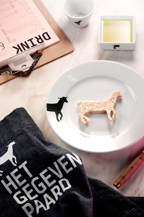
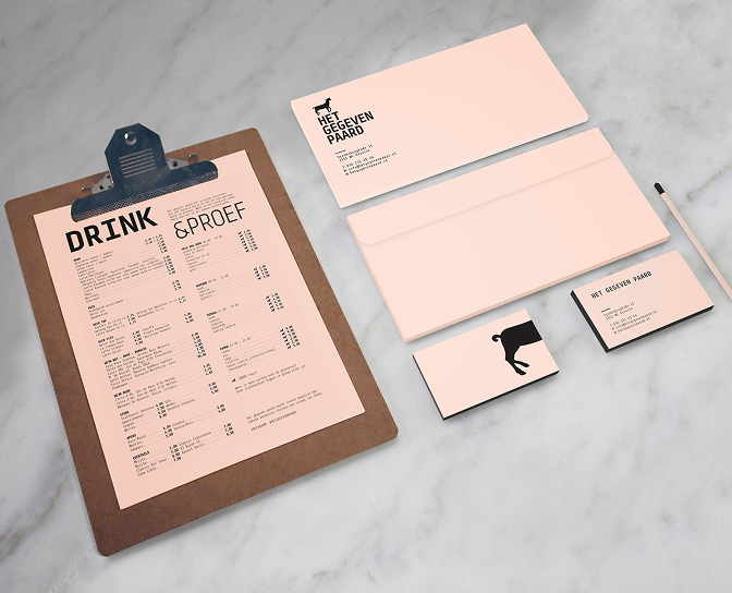
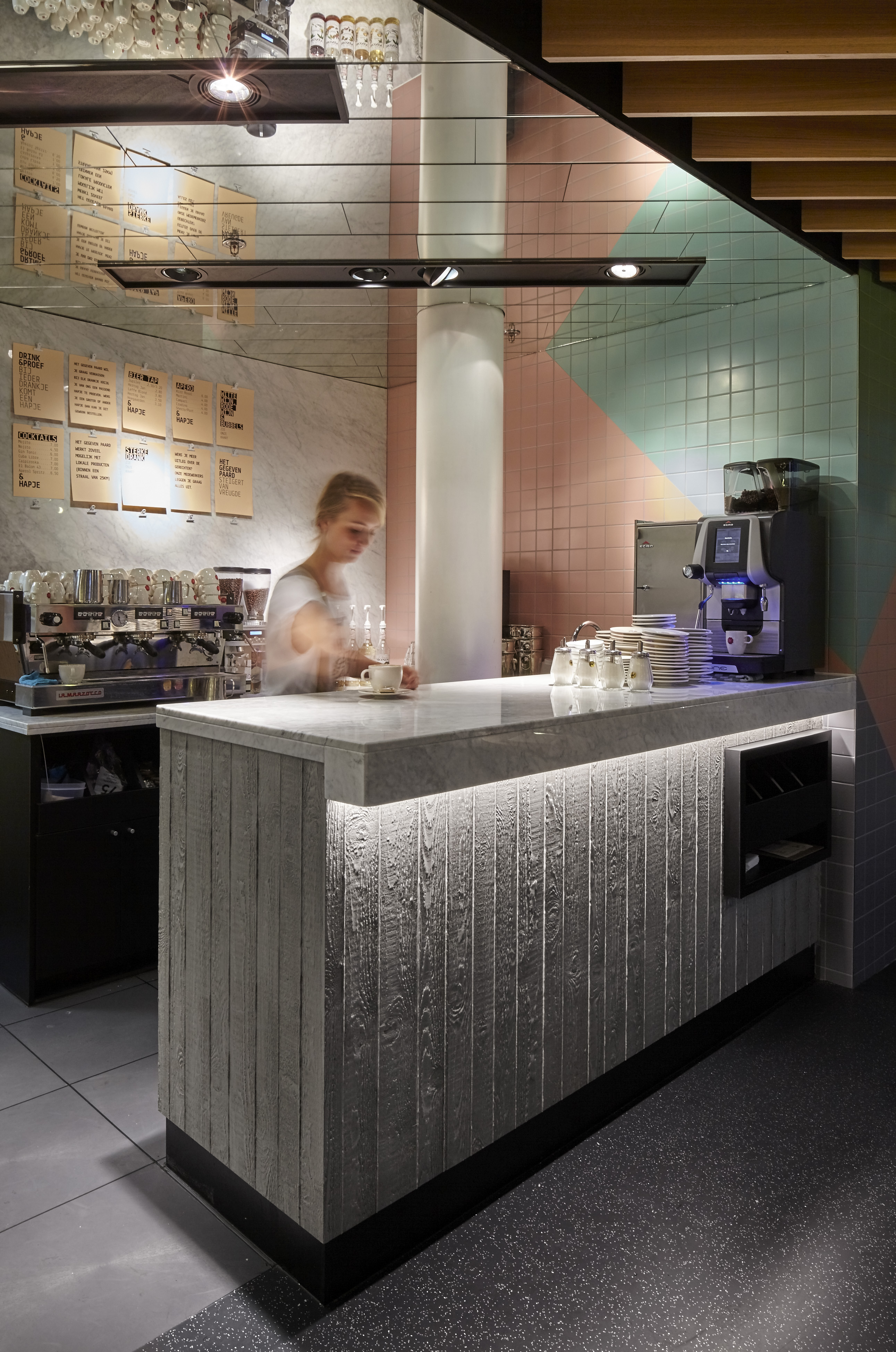
The entire concept of the branding is based on the motto ‘lean and mean’. Which means we wanted branding elements that were cheap to produce and easy to implement. In our experience, the most beautiful branding ideas are often lost in the heat of battle or, in other words, in a bar running at full speed. To prevent this from happening, we kept things simple. With a set of preprinted golden stickers, any medium can be branded very stylishly. We also provided a simple A4-template in Word, which the managers themselves can simply adapt and print on standard salmon-pink copy paper. Throughout the venue there are signboards to which these A4 prints can be easily attached with small clip-ons. This way, being up-to date is simple as that. All communication can be adapted at all times in the blink of eye, without having to wait for graphic designers or printers.
The entire concept of the branding is based on the motto ‘lean and mean’. Which means we wanted branding elements that were cheap to produce and easy to implement. In our experience, the most beautiful branding ideas are often lost in the heat of battle or, in other words, in a bar running at full speed. To prevent this from happening, we kept things simple. With a set of preprinted golden stickers, any medium can be branded very stylishly. We also provided a simple A4-template in Word, which the managers themselves can simply adapt and print on standard salmon-pink copy paper. Throughout the venue there are signboards to which these A4 prints can be easily attached with small clip-ons. This way, being up-to date is simple as that. All communication can be adapted at all times in the blink of eye, without having to wait for graphic designers or printers.
Research
The entire concept of the branding is based on the motto ‘lean and mean’. Which means we wanted branding elements that were cheap to produce and easy to implement. In our experience, the most beautiful branding ideas are often lost in the heat of battle or, in other words, in a bar running at full speed. To prevent this from happening, we kept things simple. With a set of preprinted golden stickers, any medium can be branded very stylishly. We also provided a simple A4-template in Word, which the managers themselves can simply adapt and print on standard salmon-pink copy paper. Throughout the venue there are signboards to which these A4 prints can be easily attached with small clip-ons. This way, being up-to date is simple as that. All communication can be adapted at all times in the blink of eye, without having to wait for graphic designers or printers.
Concept
Design
Build
The entire concept of the branding is based on the motto ‘lean and mean’. Which means we wanted branding elements that were cheap to produce and easy to implement. In our experience, the most beautiful branding ideas are often lost in the heat of battle or, in other words, in a bar running at full speed. To prevent this from happening, we kept things simple. With a set of preprinted golden stickers, any medium can be branded very stylishly. We also provided a simple A4-template in Word, which the managers themselves can simply adapt and print on standard salmon-pink copy paper. Throughout the venue there are signboards to which these A4 prints can be easily attached with small clip-ons. This way, being up-to date is simple as that. All communication can be adapted at all times in the blink of eye, without having to wait for graphic designers or printers.
The entire concept of the branding is based on the motto ‘lean and mean’. Which means we wanted branding elements that were cheap to produce and easy to implement. In our experience, the most beautiful branding ideas are often lost in the heat of battle or, in other words, in a bar running at full speed. To prevent this from happening, we kept things simple. With a set of preprinted golden stickers, any medium can be branded very stylishly. We also provided a simple A4-template in Word, which the managers themselves can simply adapt and print on standard salmon-pink copy paper. Throughout the venue there are signboards to which these A4 prints can be easily attached with small clip-ons. This way, being up-to date is simple as that. All communication can be adapted at all times in the blink of eye, without having to wait for graphic designers or printers.
The entire concept of the branding is based on the motto ‘lean and mean’. Which means we wanted branding elements that were cheap to produce and easy to implement. In our experience, the most beautiful branding ideas are often lost in the heat of battle or, in other words, in a bar running at full speed. To prevent this from happening, we kept things simple. With a set of preprinted golden stickers, any medium can be branded very stylishly. We also provided a simple A4-template in Word, which the managers themselves can simply adapt and print on standard salmon-pink copy paper. Throughout the venue there are signboards to which these A4 prints can be easily attached with small clip-ons. This way, being up-to date is simple as that. All communication can be adapted at all times in the blink of eye, without having to wait for graphic designers or printers.
The entire concept of the branding is based on the motto ‘lean and mean’. Which means we wanted branding elements that were cheap to produce and easy to implement. In our experience, the most beautiful branding ideas are often lost in the heat of battle or, in other words, in a bar running at full speed. To prevent this from happening, we kept things simple. With a set of preprinted golden stickers, any medium can be branded very stylishly. We also provided a simple A4-template in Word, which the managers themselves can simply adapt and print on standard salmon-pink copy paper. Throughout the venue there are signboards to which these A4 prints can be easily attached with small clip-ons. This way, being up-to date is simple as that. All communication can be adapted at all times in the blink of eye, without having to wait for graphic designers or printers.
The entire concept of the branding is based on the motto ‘lean and mean’. Which means we wanted branding elements that were cheap to produce and easy to implement. In our experience, the most beautiful branding ideas are often lost in the heat of battle or, in other words, in a bar running at full speed. To prevent this from happening, we kept things simple. With a set of preprinted golden stickers, any medium can be branded very stylishly. We also provided a simple A4-template in Word, which the managers themselves can simply adapt and print on standard salmon-pink copy paper. Throughout the venue there are signboards to which these A4 prints can be easily attached with small clip-ons. This way, being up-to date is simple as that. All communication can be adapted at all times in the blink of eye, without having to wait for graphic designers or printers.
The entire concept of the branding is based on the motto ‘lean and mean’. Which means we wanted branding elements that were cheap to produce and easy to implement. In our experience, the most beautiful branding ideas are often lost in the heat of battle or, in other words, in a bar running at full speed. To prevent this from happening, we kept things simple. With a set of preprinted golden stickers, any medium can be branded very stylishly. We also provided a simple A4-template in Word, which the managers themselves can simply adapt and print on standard salmon-pink copy paper. Throughout the venue there are signboards to which these A4 prints can be easily attached with small clip-ons. This way, being up-to date is simple as that. All communication can be adapted at all times in the blink of eye, without having to wait for graphic designers or printers.

Research
Concept
Design
Build
Another key component to the branding is the tone voice. Het Gegeven Paard is a real persona that talks to its guests. It creates a certain dynamic and interactivity. Some examples: during carnival ‘the gift horse is in the hall’ (referring to one of the most famous Dutch carnival hits), for heavier partying ‘the gift horse is hot and heavy’, for job openings ‘the gift horse is looking for stable hands’ and so on. This is a tone of voice that can be kept alive forever and has a witty character. Overall result; a bar with an attitude that is treasured by many of Utrecht’s inhabitants!
Another key component to the branding is the tone voice. Het Gegeven Paard is a real persona that talks to its guests. It creates a certain dynamic and interactivity. Some examples: during carnival ‘the gift horse is in the hall’ (referring to one of the most famous Dutch carnival hits), for heavier partying ‘the gift horse is hot and heavy’, for job openings ‘the gift horse is looking for stable hands’ and so on. This is a tone of voice that can be kept alive forever and has a witty character. Overall result; a bar with an attitude that is treasured by many of Utrecht’s inhabitants!
Research
Another key component to the branding is the tone voice. Het Gegeven Paard is a real persona that talks to its guests. It creates a certain dynamic and interactivity. Some examples: during carnival ‘the gift horse is in the hall’ (referring to one of the most famous Dutch carnival hits), for heavier partying ‘the gift horse is hot and heavy’, for job openings ‘the gift horse is looking for stable hands’ and so on. This is a tone of voice that can be kept alive forever and has a witty character. Overall result; a bar with an attitude that is treasured by many of Utrecht’s inhabitants!
Concept
Design
Build
Another key component to the branding is the tone voice. Het Gegeven Paard is a real persona that talks to its guests. It creates a certain dynamic and interactivity. Some examples: during carnival ‘the gift horse is in the hall’ (referring to one of the most famous Dutch carnival hits), for heavier partying ‘the gift horse is hot and heavy’, for job openings ‘the gift horse is looking for stable hands’ and so on. This is a tone of voice that can be kept alive forever and has a witty character. Overall result; a bar with an attitude that is treasured by many of Utrecht’s inhabitants!
Another key component to the branding is the tone voice. Het Gegeven Paard is a real persona that talks to its guests. It creates a certain dynamic and interactivity. Some examples: during carnival ‘the gift horse is in the hall’ (referring to one of the most famous Dutch carnival hits), for heavier partying ‘the gift horse is hot and heavy’, for job openings ‘the gift horse is looking for stable hands’ and so on. This is a tone of voice that can be kept alive forever and has a witty character. Overall result; a bar with an attitude that is treasured by many of Utrecht’s inhabitants!
Another key component to the branding is the tone voice. Het Gegeven Paard is a real persona that talks to its guests. It creates a certain dynamic and interactivity. Some examples: during carnival ‘the gift horse is in the hall’ (referring to one of the most famous Dutch carnival hits), for heavier partying ‘the gift horse is hot and heavy’, for job openings ‘the gift horse is looking for stable hands’ and so on. This is a tone of voice that can be kept alive forever and has a witty character. Overall result; a bar with an attitude that is treasured by many of Utrecht’s inhabitants!
Another key component to the branding is the tone voice. Het Gegeven Paard is a real persona that talks to its guests. It creates a certain dynamic and interactivity. Some examples: during carnival ‘the gift horse is in the hall’ (referring to one of the most famous Dutch carnival hits), for heavier partying ‘the gift horse is hot and heavy’, for job openings ‘the gift horse is looking for stable hands’ and so on. This is a tone of voice that can be kept alive forever and has a witty character. Overall result; a bar with an attitude that is treasured by many of Utrecht’s inhabitants!
Another key component to the branding is the tone voice. Het Gegeven Paard is a real persona that talks to its guests. It creates a certain dynamic and interactivity. Some examples: during carnival ‘the gift horse is in the hall’ (referring to one of the most famous Dutch carnival hits), for heavier partying ‘the gift horse is hot and heavy’, for job openings ‘the gift horse is looking for stable hands’ and so on. This is a tone of voice that can be kept alive forever and has a witty character. Overall result; a bar with an attitude that is treasured by many of Utrecht’s inhabitants!
Another key component to the branding is the tone voice. Het Gegeven Paard is a real persona that talks to its guests. It creates a certain dynamic and interactivity. Some examples: during carnival ‘the gift horse is in the hall’ (referring to one of the most famous Dutch carnival hits), for heavier partying ‘the gift horse is hot and heavy’, for job openings ‘the gift horse is looking for stable hands’ and so on. This is a tone of voice that can be kept alive forever and has a witty character. Overall result; a bar with an attitude that is treasured by many of Utrecht’s inhabitants!

Research
Concept
Design
Build

Research
Concept
Design
Build


Research
Concept
Design
Build
Research
Concept
Design
Build

Research
Concept
Design
Build


Research
Concept
Design
Build
Research
Concept
Design
Build

bar baron

Grand Café Flamingo


